
Overview
Research revealed that OfficeSupply's search and navigation experience was hindering product discovery and creating friction for users. I spearheaded a two-part redesign to address these pain points: a reimagined search field with contextual states and improved feedback, and a secondary navigation bar that exposed product categories at the top level, allowing users to shop directly from the header.
My Role
As the sole in-house UX Designer, I drove this two-part redesign, leading all research, competitive analysis, prototyping, and final design documentation.
Timeline
September 2025
Problem Statement
OfficeSupply.com's current search and navigation experience presented several barriers to product discovery:
Search Experience Issues:
Users received minimal feedback when interacting with the search bar, making it unclear they were engaging with the feature
Icon touch targets were too small, creating frustration on mobile devices and increasing mis-tap errors
The search results dropdown contained excessive and irrelevant information, cluttering the interface
Navigation Structure Issues:
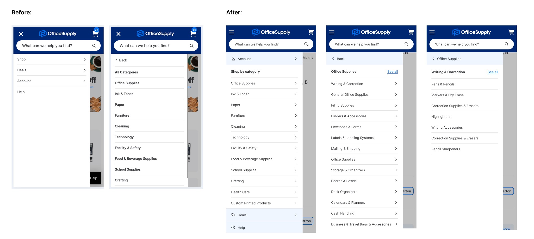
Product categories were hidden behind a single navigation item, forcing users to take extra steps to understand the product catalog scope
Users couldn't navigate deeper into the category hierarchy from the mobile menu—they had to visit top-level category pages instead, creating friction
The current structure made it difficult for users to determine what the site offered without exploration

Research & Insights
Heuristic Evaluation
I conducted a heuristic evaluation of the existing search experience and identified three critical issues:
Limited System Feedback – The search bar provided minimal visual feedback when users interacted with it, creating uncertainty about whether their actions registered
Insufficient Touch Targets – Search and exit icons fell below the 44x44 pixel mobile standard, increasing mis-taps and user frustration
Information Overload – The search results dropdown was cluttered with irrelevant information, making it difficult for users to scan and find what they needed

Secondary Research
To guide the navigation redesign, I researched ecommerce best practices primarily through the Baymard Institute and identified several key recommendations that directly addressed OfficeSupply's pain points:
Making Product Categories the First Level of Navigation: When categories are hidden behind a single menu item, users must take extra steps to understand the site's scope and available products. This was particularly problematic for OfficeSupply—while the company name suggests a narrow product range (office supplies), the catalog actually includes technology, craft supplies, and more. Exposing categories upfront would immediately communicate this broader offering.
Mobile Navigation Depth: Our mobile menu only allowed users to select top-level categories, with no way to navigate deeper into the category tree. Users were forced to visit category landing pages to continue browsing, creating unnecessary friction. Baymard recommends including "View All" options at each hierarchy level (placed first in the list) to enable progressive navigation without leaving the menu.
Visual Differentiation in Mobile Menus: We weren't distinguishing between different types of navigation items—category shop pages appeared the same as utility pages like "Help" or "Deals." Baymard recommends visually differentiating menu items based on their importance to guide user attention and clarify the navigation structure.

Competitive Analysis
To validate my findings and understand industry standards, I audited five leading ecommerce competitors: Staples, Amazon, Walmart, Target, and Quill. This analysis revealed consistent patterns that confirmed the Baymard recommendations weren't just theoretical—they were proven solutions users encounter daily. Adopting similar patterns would leverage Jakob's Law: users prefer sites that work like the ones they already know.

Design Approach
Header & Desktop Navigation Design
I explored multiple desktop menu approaches, including slide-out and mega-menu designs. We ultimately deferred the mega-menu because our current category taxonomy requires a comprehensive review; using it now would present too many categories with outdated naming, potentially overwhelming users. For this initial phase, we opted for a standard dropdown menu with progressive disclosure. We can revisit the mega-menu once the taxonomy is refined in a separate initiative.
For the header layout, I created and collaborated with the team to evaluate several options. We selected Option 3, which provided the optimal balance between immediately exposing categories and maintaining visual clarity, ensuring the header remained scannable and organized. Alternative header variations will be prioritized for future A/B testing.


Search Bar Design
I mapped out all necessary search states and explored multiple design options for each, keeping in mind development constraints—our search experience connects to an external API, so I prioritized feasible solutions that could be implemented within our timeline.
New Customers (Focused/Pre-typing State):
Option A - Maintain current styling with improved contrast (lighter blue outline) and dark overlay for focus
Selected: Option B - Display trending searches
This option balanced user benefit with development feasibility. Trending searches help new customers understand what's popular while providing a stronger visual cue that the search bar is active—a significant improvement over the faint outline we currently used.
Option C - Trending searches + trending product cards

Returning Customers (Focused/Pre-typing State):
Option A: Show recently searched items
Selected: Option B - Show recently searched items + trending searches
Recently searched items give returning customers quick access to their history, while trending searches provide exploratory options for users unsure what to search for. The minimal design prevents distraction while maintaining utility.
Option C: Show recently searched items + popular product cards

Active State (new and returning customers):
Remove "Recently Searched" to reduce cognitive load
When users are actively typing, their intent shifts from exploration (trending/recent) to precision. We removed 'Recently Searched' and trends in the active state to reduce cognitive load, ensuring the interface supports focused, high-speed entry without distraction.
Clean up the UI for a focused, distraction-free search experience

Mobile Menu Redesign
The mobile menu underwent significant changes to address the core UX issue of limited navigation depth:
Implemented a progressive disclosure pattern allowing users to expand categories and subcategories within the menu
Added "See All" options at each hierarchy level (placed first) to give users quick access to browse an entire category
Applied visual differentiation to distinguish between primary categories, subcategories, and "See All" actions
Impact & Future Direction
Conclusion & Outcome
The redesigned search and navigation system successfully addresses the core barriers to product discovery. By leveraging e-commerce best practices, the solution makes three foundational improvements:
Exposed Navigation: An exposed secondary navigation immediately communicates OfficeSupply's full product catalog, significantly reducing the cognitive burden on new users.
Intuitive Search: The enhanced search bar—with its dynamic contextual states and clear feedback—provides a more intuitive and high-utility experience for all shoppers.
Frictionless Mobile: The restructured mobile menu eliminates unnecessary steps, allowing users to navigate the full product hierarchy without being forced onto category landing pages.
Next Steps & Future Work
This initial launch established a strong foundation for optimization. The project's next phases will focus on validating and scaling the solution:
A/B Testing: Launch alternative header layouts and search dropdown variations to validate which designs yield the highest engagement and lowest abandonment rates.
Taxonomy Review: Collaborate on a dedicated initiative to refine and rationalize the category taxonomy.
Mega-Menu Implementation: Revisit the mega-menu approach once the taxonomy review is complete to offer broader product exposure on desktop.
Quantitative Metrics Review: Analyze post-launch KPIs, such as search-to-purchase rates and mobile menu usage, to quantify the success of the redesign and inform subsequent iterations.